
Visual design foundations reflections
My 14 days with graphic designing (graphic messing around)

My last two weeks have all been around creating images, creating style tiles, creating this, creating that etc. It was an interesting journey. It definitely made me very comfortable with affinity.
It all began with creating mood-boards. So basically mood board is a space where you throw all the little things that help you express your mood. If blue made you happy you can collect 20-30 different blue themed pictures and make them fit in a board. This way you can always come back to your mood-board for a little inspiration if your current work theme required blue.
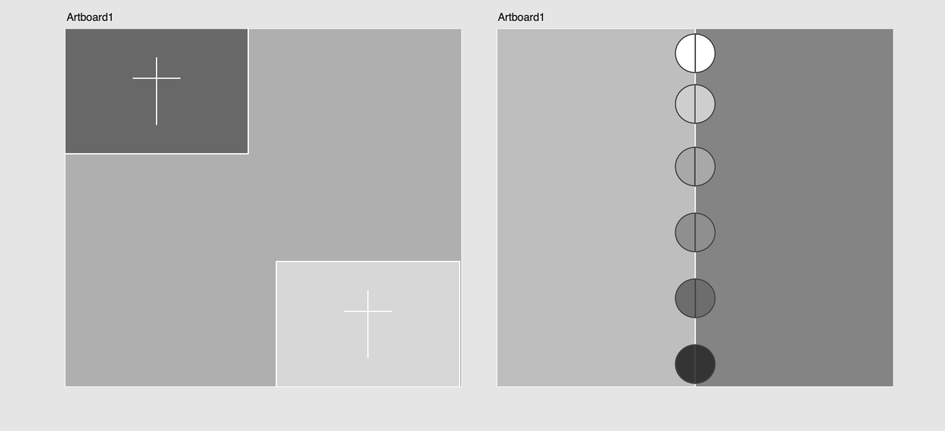
Following that, we toyed around with black and white graphics. It was interesting as we were tasked with making images with only white and black colors, along with colors in between them. It was very intriguing as it made me understand the broad concept of grayscale and how with it’s limited boundary one could create high-standard graphics.
Then we came to the topic of right spacing and scaling on a webpage. This is always super important for a webpage to appear neat and clean. You have to create even or identical spaces between all parts of a website for it to make a visitor stay longer on the website.
Upon concluding the topic of spacing and scaling, we came across style tiles. So the concept of style tiles was to create a style on a tile, that could help you incorporate it later to your website. You could create different tiles which would help you implement a design on your website easily. This lesson was more based upon the idea of creating style tiles for our portfolio’s.
We further created more graphics which were based on activities that went as follows: 1) Create a postcard that gave vibe of a city. 2) Create a graphic using black and white that created a feeling of a secret word. Both of these activities were very fun as they tickled the creative side of me and made me push my thinking outside a box. As I am averagely better at affinity, It was all very fun. I did both the challenges well enough.
Finally came the biggest task of the week followed by a fun task. The biggest task was to create style tiles for a store. It has to include almost everything and beyond. For instance, a website for a store that had products to sell have different components such as sold out box, sale box, sliders, buttons, etc. We had to style alot of the components. I initally did not understand the concept and went on to create the graphic of a full website, but later was corrected and did the task successfully. It’s amazing to comprehend the amount of work that goes into creating a website. So much goes on beyond the pictures.